For over a decade, the experience of watching an esports match hasn't changed online. I noticed this stagnation and lack of innovation is frustrating for gamers who enjoy esports.
A software that is inclusive to all esport viewers.
UI/UX Designer & User Researcher
12 weeks
I conducted a survey to understand where gamers stand when it comes to watching esports. I also interviewed 3 surveyee's to better understand how they currently feel about the esport viewing experience to better empathize with their frustrations.


To understand why gamers are frustrated with the esports viewing experience. I created a user persona based on 3 interviews. I decided by understanding the frustrations of esport viewers I can empathize with them and cater to their frustrations.

I had the opportunity to interview Markel Lee who is involved with esport streaming services and esports in general. From my interview, I learned, that I was focusing on people who are aware of gaming and esports. When the esports industry is focusing more on bringing in new people to esports who aren't familiar with esports. This caused me to pivot my approach to bringing in more casual viewers to esports.

Watching esports is becoming hard to get into for new users and not as engaging to watch for users who understand esports and the game.
The esports industry needs new viewers to continue to grow while keeping retention with current users. If esports is less accessible it would be harder to grow the industry.
Now that I know my user's frustrations I can set the criteria when ideating. Does this improve users' PC performance, reduce the learning curve, increase engagement, and excite users?
I did HMWs to generate ideas on how to solve users' pain points. I chose this method because I wanted to take my research and brainstorm potential opportunities for Rival Cast. During this step, I was more concerned with generating ideas regardless of feasibility for now to create creative solutions that fit my key takeaways.

After generating ideas in a nonconstrictive brainstorming session. I had to get realistic given the time constraint of this project. By making a user prioritization grid not only would I understand what's most important for me to deliver by the deadline. I also understood what was important to my users based on their pain points.

My design iterations were around the main features of Rival Cast. While sketching, the criteria were: Can someone who has never watched esports understand the structure, and use it effectively without frustration? The reason behind these criteria was to keep the esports viewing experience inclusive.


After figuring out the structure through paper sketches. I wanted to see how usable the screens where. I decided to keep my wireframes minimal in some areas so testers can focus on the interaction rather than the composition of the page. I learned some features where missing on certain screens and most screens where easy to understand for people who are not familiar with esports.

I learned through user testing that not all the information was there that user's needed to be as informed about the upcoming match as possible. This lead me to go back and rethink the layout a bit differently to include details that user's wanted to know.
User's had no issue figuring out how to send a chat or join a channel. However somethings where left unclear and made me go back and rethink the layout of the design.


During this user test I did a A/B test to see which tutorial layout they prefered. The tutorial where it popped up in the middle of the screen with the icon showing the tool name was the most informative to most testers. However while testing I learned that some things where missing from the tutorial and stream page.
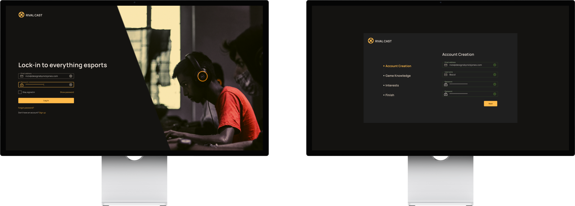
From my research, I knew it was important to cater to new users. During the initial account creation. Assessing viewers' interests and comfortability in esports can help recommend them streams and communities to watch and retain viewers on coming back.

The home page allows users to see what's happening and when. The home page is primary used to get users into one of three sections. Betting, a livestream, or a community.

Rival Cast has unique tools that other platforms don't offer. To convert new users it was crucial to highlight those features the first time they interact with Rival Cast. We also wanted to explain what those features do so users can have a little bit of understanding before using the feature.

From my research, I learned some people don't like to watch matches because there wasn't any point. By adding a betting system to Rival Cast those viewers who had no interest before now have an incentive to watch matches they might normally watch in hopes they win points to redeem for prizes in their favorite video games.

From my research I learned users mostly watch esports together. Having a team chat feature, users have a place to share their content, watch esports, and bet on esport matches. Which increases interest, have a place to help reduce the learning curve of esports, and if users download Rival Cast instead of watching it from a brower can decrese PC demand.

This project allowed me to dive deeper into understanding the user and how to increase engagement. Talking to experts and user testing with users who aren't familiar with esports it allowed me to get a solution that is easy to understand regardless of esports or gaming knowledge.
Rival Cast has a solid foundation to build upon . The next step I would take is to build user profile page to add a mangement for subscriptions on certain channels and premium content. I would also like to add microinteractions to success screens to help users.